

Demystifying Grid Systems for Fast Layouts | CiptaVisual
Stop guessing layout alignment and build clean, professional designs in minutes with simple spatial grid frameworks.

Ever stared at a finished flyer, pitch deck slide, or landing page design and felt that something was subtly wrong, even if you could not put your finger on it? The typography looks acceptable, the color palette matches the brand guidelines, but the composition feels loose, cluttered, or off-balance. You end up spending 45 minutes nudging headline boxes left and right by three pixels, hoping the layout will magically snap into harmony.
Mastering grid systems in graphic design eliminates this guesswork entirely. Instead of placing elements by eye, a structural grid provides a clear mathematical backbone that guides every decision you make. For solo freelancers and small creative teams working under tight deadlines, using a grid is not about restricting creativity. It is the fastest route to producing clean, balanced layouts without endless trial and error.
Why Unstructured Layouts Fail (And How Grids Fix Them)
When you align graphics without an underlying framework, human visual perception senses the lack of order almost immediately. The human eye craves structure. It scans visual compositions searching for relationships, rhythm, and alignment. Without a deliberate grid, elements appear to float aimlessly on the canvas.
Unstructured layouts create several recurring problems for client projects:


- Visual Friction: Readers spend energy trying to figure out where to look next instead of absorbing your content.
- Inconsistent Spacing: Margins vary from page to page, making multi-page PDF proposals look amateurish.
- Bloated Production Time: You spend hours moving items around manually rather than assembling structured content modules.
- Client Friction: Stakeholders sense the lack of balance and send back vague revision requests like “Can you make it look more organized?”
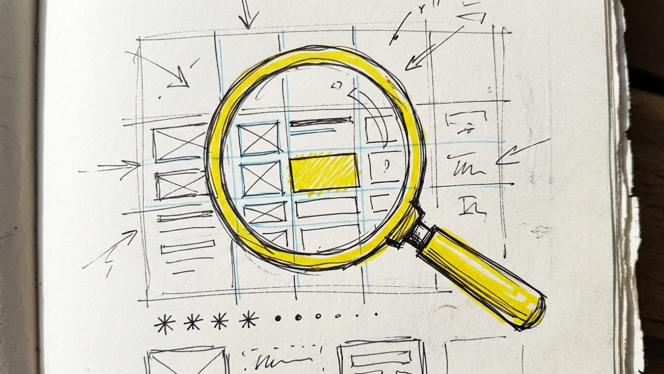
A grid acts as an invisible structural skeleton. It defines exact boundaries for text columns, images, callout boxes, and margins. When you anchor every visual element to a shared set of vertical and horizontal lines, the entire asset feels cohesive instantly. Understanding brand identity design principles becomes far easier once you have a reliable spatial layout framework in place.
Grid Anatomy 101: The Core Building Blocks
You do not need a degree in Swiss graphic design to master structural grids. The whole framework relies on four simple structural concepts that work together to create order.
1. Columns
Columns are the primary vertical zones spanning from the top margin to the bottom margin of your canvas. Content sits within these columns. A single-column layout works best for long text like articles or novels, while 4-column, 8-column, or 12-column layouts give digital designers flexible options for combining text, images, and buttons side by side.
2. Gutters
Gutters are the spaces between columns. They prevent neighboring elements from running into each other. If your columns are 120 pixels wide, a 24-pixel gutter ensures that text in column one stays distinctly separated from graphics in column two. A good general rule: wider gutters create a relaxed, spacious feel, while narrower gutters create tighter visual associations.
3. Margins
Margins are the safety buffers around the outer edges of your canvas. They separate your content from the edge of the paper or screen frame. Tight margins make layouts look crowded and uncomfortable. Generous margins focus the viewer’s attention toward the center of the composition and give the eye a natural resting place.
4. Baseline Grid (Horizontal Rhythm)
While columns handle vertical alignment, the baseline grid manages horizontal alignment. It consists of thin horizontal guides spaced at fixed intervals, such as 4, 8, or 12 pixels. Aligning the line-height of your body copy and headings to a baseline grid ensures that text lines in adjacent columns line up across the page.
The 3 Go-To Grid Frameworks for Modern Layouts
You do not need dozens of complex grids to handle client work. Around 90% of marketing collaterals, digital assets, and brand print materials can be created using three core grid structures.
The Manuscript Grid (Single Column)
The manuscript grid is the oldest structural format in typography, derived directly from hand-copied manuscripts. It features a single large content block surrounded by generous outer margins.
Best for: E-books, long-form editorial essays, case studies, privacy policy pages, and simple text documents.
Pro Tip: Ensure your line length stays between 50 and 75 characters per line (roughly 10 to 14 words). Lines that span too wide across a single manuscript layout tire the reader’s eye when tracking back to the next sentence.
The Column Grid (Multi-Column Versatility)
Column grids split the page into multiple vertical bands. Elements can span across a single column or stretch across multiple adjacent columns to create visual variety.
- 3-Column Setup: Great for print brochures, corporate newsletters, and blog archive pages.
- 4-Column Setup: Ideal for social media carousels, presentation slides, and marketing flyers.
- 12-Column Setup: The industry standard for digital interface design and web development. Because 12 divides cleanly by 2, 3, 4, and 6, a 12-column grid gives you total flexibility to build 2-column, 3-column, or 4-column sub-layouts inside a single artboard.
The Modular Grid (Matrix for Complex Data)
A modular grid adds horizontal spatial rows to your vertical columns, creating a matrix of equal boxes called modules. You can combine these modules into horizontal and vertical functional blocks.
Best for: E-commerce product listings, SaaS analytics dashboards, digital magazines, schedules, and complex event program schedules.
Modular grids bring clear structure to projects with lots of small, competing data points. They prevent visual clutter on content-heavy pages, giving every block a clear place to live.
How Freelancers & Small Teams Can Setup Grids in Under 5 Minutes
Integrating grid systems in graphic design into your daily software workflow does not need to slow you down. Here is how to configure layout grids quickly across popular tools.
Setting Up Grids in Figma
Figma makes working with layout grids straightforward. Select your frame (e.g., Desktop 1440×900 or Instagram Post 1080×1080), click Layout Grid in the right-hand panel, and change the grid type from Grid to Columns.
Set your parameters:
- Count: 12 columns for desktop layouts, 4 columns for mobile screens.
- Margin: 64px for desktop, 16px for mobile.
- Gutter: 24px for desktop, 12px for mobile.
Combine these grid settings with Figma Auto Layout components to build responsive layouts that reflow automatically when content changes. Combining structured grids with an automated AI graphic design workflow guide helps solo creators speed up production and deliver polished client decks in record time.
Setting Up Grids in Adobe Illustrator & InDesign
In Adobe InDesign, choose Layout > Margins and Columns directly from the top menu bar. Define your desired number of columns and set the gutter distance (e.g., 5mm or 18pt). Enable Snap to Guides to lock your visual assets onto the column lines automatically.
In Adobe Illustrator, create a rectangle matching your artboard dimensions minus your margins. Go to Object > Path > Split Into Grid. Input your column and row counts, specify your gutter distance, check the preview box, and click OK. Select the generated shape paths and press Cmd + 5 (Ctrl + 5 on Windows) to convert those vector lines into permanent background guide lines.
Working with Grids in Canva
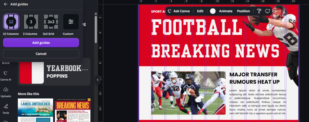
While Canva lacks a dynamic 12-column overlay system, you can easily build manual guides. Go to File > View Settings > Add Guides. Select a custom column guide structure (e.g., 3 or 4 columns with a 16px gap). Alternatively, pull visible horizontal and vertical ruler guides directly from the canvas edge to set up quick border constraints for your graphics.
Real-World Case Study: Redesigning a Slide Deck in 17 Minutes
Consider a practical example. A freelance brand strategist was asked to refine a 10-slide pitch deck for a regional client. The original deck was a visual mess: headlines jumped around across slides, image cards were inconsistent sizes, and bullet points sat dangerously close to the bottom screen border. The original designer spent over three hours tweaking the layout manually, yet the presentation still looked disjointed.
The strategist applied a simple grid system approach:
- Set up a standard 16:9 widescreen master slide canvas.
- Applied an 8-column grid overlay with 48px outer margins and 20px gutters.
- Assigned standard column spans: 5 columns for main imagery, 3 columns for side typography blocks.
- Locked the primary title height across all 10 slides to a fixed top baseline guide.
The entire re-alignment took just 17 minutes. The result? The pitch deck looked clean, balanced, and professional. The client approved the deck on the spot without asking for visual tweaks, saving hours of revision time for the team.
Final Checklist for Practical Layout Quality
Before sending any marketing asset, web design mockup, or brand asset to a client, evaluate your layout against this quick structural checklist:
- Column Alignment: Are text frame edges and photo cards snapped to column borders rather than floating randomly in space?
- Hierarchy Spanning: Do high-priority headlines span multiple columns (e.g., 8 out of 12 columns) so they stand out clearly from body text?
- Proportional Margins: Are outer page margins wider than inner column gutters to give content room to breathe?
- System Consistency: Do repeating elements—like slide headers, card borders, or button shapes—follow identical grid placement across pages?
When building high-converting landing pages or agency portfolio pages for local SEO for creative studios, maintaining this visual discipline keeps bounce rates low and improves prospective client trust.
Conclusion: Make Grids Your Unfair Workflow Advantage
Grid systems in graphic design are not restrictive rules that hold back artistic expression. They are supportive frameworks that remove layout guesswork, reduce production time, and ensure every visual asset looks clean and intentional. By spending five minutes setting up simple columns, gutters, and margins before starting a design project, freelancers and small teams can deliver polished layouts consistently while working faster than ever.
Discover more from CiptaVisual
Subscribe to get the latest posts sent to your email.