
Minimalism Is Boring, Chaos Is Costly: Finding the Visual Middle Ground for Your Small Brand
A practical guide to blending clean structure with bold personality, so your brand stands out without scaring off the clients who pay well.

The Brand Identity Crisis: Why Clean Feels Invisible and Bold Feels Risky
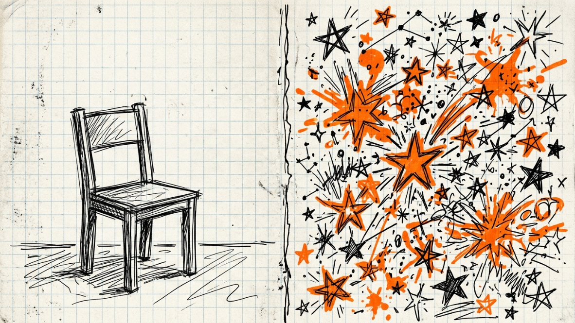
Open ten small business websites in a row and you’ll notice the same thing: white space, a sans-serif logo, a muted color palette, and a stock photo of someone laughing at a laptop. It’s safe. It’s also forgettable.
Minimalism became the default because it’s easy to execute and hard to get wrong. Clean layouts load fast, look “premium,” and rarely offend anyone. But when every brand in your category uses the same formula, clean stops looking premium and starts looking generic.
The opposite extreme has its own problem. Maximalist design pulls attention with clashing colors, layered graphics, and loud typography. It works on a phone screen for three seconds. It can fall apart on a business card, a product label, or an invoice, where a client needs to trust you, not just notice you.
This is the identity crisis facing small creative studios and freelancers right now: play it safe and disappear, or go bold and risk looking amateurish. Neither option is good enough. The real opportunity sits in between.


Deconstructing the “Maximalist Chaos” Trend
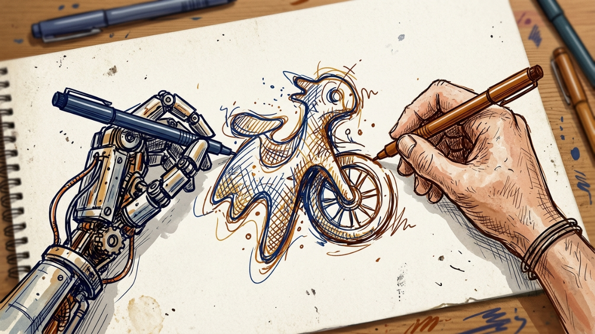
Design researchers have been tracking a sharp return to raw, unpolished visuals, often called neo-brutalism or “anti-design.” The style embraces raw, unpolished visuals that stand out in a sea of sleek, minimalist templates, challenging norms and creating a sense of urgency or irreverence. Brands like Balenciaga and Diesel have used it to break away from convention on purpose.
Part of the reason this trend exploded is fatigue with sameness. After a decade of nearly identical clean layouts using the same rounded cards and the same fonts, many product pages became hard to tell apart, and AI page builders made the problem worse by shipping similar templates at scale. Designers pushed back with something that felt handmade again.
On social feeds, this chaos works. A scroll-stopping, high-contrast graphic earns a like in under a second. But packaging and print live in a slower, more physical context. A shopper holding a product in-store, or a client reviewing a printed proposal, needs their eyes to rest somewhere. Full-page chaos with no visual anchor reads as disorganized, not confident.
That’s the gap. Maximalism sells energy. It doesn’t sell trust on its own. And trust is what turns a follower into a paying client.
The Hybrid Formula: Structure First, Then Personality
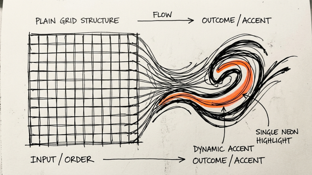
The strongest brand identities in 2026 aren’t picking a side. The winning formula uses minimalist principles to create clarity and usability, then adds strategic maximalist elements to inject personality and memorability. Industry researchers describe this as “intentional maximalism over minimal foundations”: a clean, disciplined grid that carries a few loud, deliberate accents.
Here’s what that looks like in practice:
- Grid stays quiet. Margins, spacing, and alignment follow a strict, predictable system. This is what makes a design feel professional instead of chaotic.
- Typography carries the energy. One oversized, expressive headline font paired with a plain, highly readable body font. The contrast does the work that a dozen colors used to do.
- Color stays limited on purpose. One or two accent colors, used consistently, hit harder than a rainbow palette used once.
- Texture replaces excess. A grain overlay, a hand-drawn line, or a subtle emboss can add warmth without adding visual noise.
Context still matters. A logo can stay minimalist for app icons and business cards, then expand into a richer, more detailed version for large-format applications like packaging or signage. You’re not choosing one aesthetic forever. You’re choosing the right dose of expression for each touchpoint.
| Touchpoint | Lean Minimalist | Lean Maximalist |
|---|---|---|
| Logo mark (favicon, app icon) | ✔ | |
| Social media graphics | ✔ | |
| Packaging / product label | ✔ (with one bold accent) | |
| Brand launch or campaign page | ✔ | |
| Invoices, contracts, proposals | ✔ |
Resource-Friendly Implementation on a Small Budget
You don’t need a big design team to pull off a hybrid identity. You need discipline about where you spend your visual budget.
Start with a design system, not a mood board. Lock in your grid, your two fonts, and your one or two accent colors before you touch a single graphic. This single step prevents the “chaotic” failure mode more than anything else, because every loud element you add later has boundaries to sit inside.
Spend your money on the parts people touch. A stronger paper stock for a business card or a single custom illustration for a homepage hero does more for perceived quality than ten free stock icons. One accessible way to try this is to start with a simple, structured layout, then layer in colorful, imperfect visuals that feel playful and a bit random.
Sustainability is also part of the budget conversation now. Brands are turning to texture, form, and finish instead of excess materials or complex finishes, letting subtle details like embossing and natural pigments create depth without waste. That’s a practical win for a small studio: fewer print runs, fewer materials, and a more premium feel.
A few low-cost moves that punch above their weight:
- One hand-sketched or custom icon set instead of a generic stock library.
- A single bold, free or affordable display font (check the license for commercial use) paired with a plain system font.
- A reusable Figma or Canva template locked to your grid, so every new asset stays consistent without a designer redoing the math each time.
- A one-page brand sheet your whole team (even a team of one) checks before publishing anything.
Case Studies: Standing Out Without Looking Amateurish
Fashion and lifestyle brands have led the way on strategic maximalism. Pinterest’s design forecast coined the term “Mix and Maximalist” to describe a surge in consumer interest for expressive, high-impact brand worlds, with brands using elaborate logo design and saturated palettes to create a sense of discovery. The key word is “sense of discovery,” not visual overload. Every loud choice still points back to a recognizable core mark.
On the other end, service-based and trust-driven categories are proving the opposite point. For industries like fintech, healthcare, and high-end software, minimalism remains the dominant force because it signals stability and sophistication, and lightweight, minimalist assets that load faster have been shown to lift conversions. A small accounting firm or local clinic has little to gain from brutalist chaos and a lot to lose in trust.
The pattern across both examples: the brands that win aren’t guessing. They’re matching their visual intensity to what their specific audience needs to feel before they buy.
Key Takeaways
- Pure minimalism risks blending in. Pure maximalism risks looking chaotic and unprofessional off-screen.
- The strongest small-brand identities use a disciplined grid as the foundation, then add one or two bold, consistent accents.
- Match visual intensity to the touchpoint: quieter for anything that needs to build trust (contracts, packaging, business cards), bolder for anything built to grab attention (social, campaigns).
- Spend limited budget on the few assets people actually touch or remember, not on covering every surface with decoration.
Discover more from CiptaVisual
Subscribe to get the latest posts sent to your email.