

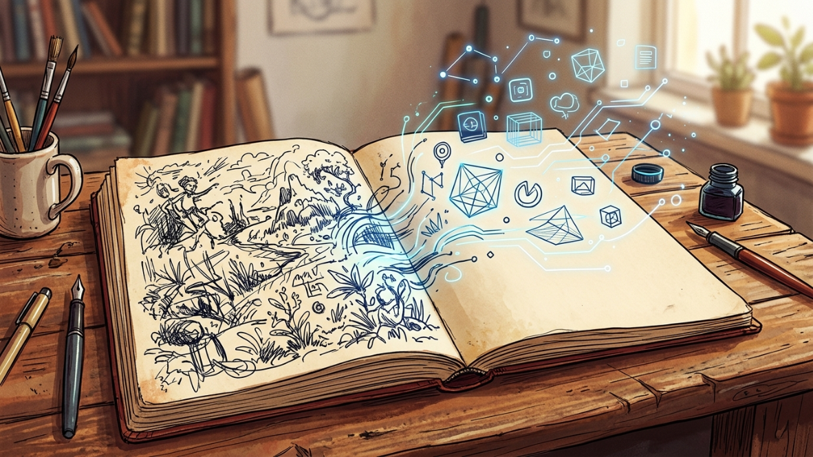
Human-First Branding: How to Stand Out From AI-Generated Design
Why craftsmanship, not automation, is becoming the real competitive edge for small studios and freelancers.

Open Instagram or Pinterest for five minutes and you’ll notice something: everything is starting to look the same. The same glossy gradients, the same suspiciously symmetrical faces, the same “on-brand” illustration style that a thousand other small businesses are also using this month. This is the backdrop against which human-first branding is emerging as one of the most important shifts in graphic design and small business marketing right now — not as a rejection of technology, but as a deliberate response to what happens when everyone has access to the same tools.
If you’re a freelance designer, a solo marketer, or a small studio owner, this matters to you directly. Human-first branding isn’t a nostalgic throwback to “the old ways.” It’s a practical, defensible position that’s starting to command real premiums in a market flooded with generic AI output. This article walks through why that’s happening, where most brands get it wrong, and exactly how to build a visual identity that reads as unmistakably human — without abandoning the efficiency AI genuinely offers.
The Sea of Sameness: Why AI-Generated Assets All Start to Look Alike
Generative AI tools are extraordinary at producing competent design in seconds. What they’re not good at is producing design with a point of view. Because these models are trained on massive, averaged datasets, their default output gravitates toward the statistical middle — smooth gradients, centered compositions, a kind of visual politeness that rarely offends but also rarely moves anyone.
Consumers have started to notice, and the backlash is measurable. Public pushback against AI-generated marketing has pushed a number of brands to actively demonstrate that their campaigns were made by real people rather than lean further into automation, according to Marketplace. Some brands have hired directors specifically to produce behind-the-scenes footage proving a human touch was involved, which tells you how far the pendulum has swung.
Fatigue is the operative word. Research covered by Mojo Creative Digital found that more than half of Americans now report experiencing AI fatigue, a frustration that builds from repeated exposure to content that feels machine-generated or impersonal. For designers and small business owners, that fatigue is an opening. When your competitors’ visuals blur into algorithmic sameness, a distinct, human-first branding approach becomes one of the few remaining ways to actually get noticed.
What Human-First Branding Actually Looks Like

Visually, human-first branding tends to share a few recognizable traits. Lines have slight variation instead of mathematically perfect smoothness. Color palettes lean toward the imperfect and specific rather than the safely averaged. Typography often incorporates custom or hand-lettered elements rather than defaulting to whatever font a generator suggests. None of these choices are accidental — they’re small signals of a human decision-maker behind the work.
This is consistent with what’s showing up across creative industries more broadly. Analysis from Crea8ive Solution points to a growing share of senior creative directors who are deliberately rejecting purely AI-generated assets for flagship campaigns, citing a need for a sense of provenance that automated output can’t fake. Our own coverage of where logo design is heading has flagged a similar tension between speed and soul — you can read more in our deep dive on the future of logo design.
Here’s the part most explainers skip: authenticity isn’t about avoiding every polished element. A brand can use vector precision for its logo mark and still feel human-first if the surrounding system — packaging texture, illustration style, photography direction — carries evidence of a hand at work. It’s a system-level decision, not a single stylistic tic.
Where Most Brands Get Human-First Branding Wrong
The most common mistake I see, both from clients and from other designers, is treating “human-first” as a marketing label rather than an operating principle. A brand will slap a “handcrafted” badge on packaging that was, in fact, assembled entirely from stock AI templates. Consumers are better at spotting this than businesses expect. Survey data from Clutch found that more than a third of consumers say seeing real people behind a brand is the single strongest driver of their loyalty — stronger than price or product quality. That’s not a signal you can fake with a badge.
I once worked with a client, a small skincare line, who wanted a “handmade” aesthetic applied to their branding but had generated their entire product photography and packaging illustration through an AI tool with zero art direction. The results looked technically fine and completely hollow. When we rebuilt the illustration style from actual hand-drawn botanical sketches, then vectorized and refined them, sales conversations with retail buyers changed almost immediately — buyers specifically commented on the packaging feeling “considered” rather than templated. That distinction, considered versus templated, is the whole game.
The second common error is overcorrecting into a rigid anti-AI stance that sacrifices real efficiency. Brands that swing this way often burn out their creative teams doing manual work that AI could handle responsibly, like initial concept exploration or asset variations, while reserving human judgment for final decisions. The goal isn’t to reject every tool. It’s to make sure a human is always the one deciding what represents the brand.
How to Blend Handcrafted Texture with Vector Precision

Building a genuinely human-first branding system doesn’t require abandoning your software. It requires a workflow where handmade texture and digital precision take turns doing what each is best at. Here’s a practical sequence that works for small studios on tight timelines:
- Start on paper or with a stylus, not a template. Even five minutes of loose sketching for a logo mark, icon set, or pattern introduces irregularity that reads as intentional rather than generated.
- Vectorize selectively, not completely. Trace the core shapes for scalability and consistency, but leave a few textural elements — a rough edge, a slight line-weight variation — untouched so the asset doesn’t get sanded into sterility.
- Build a “texture library” once, reuse it often. Scan a handful of real paper grains, ink bleeds, or brush textures and layer them into your vector work as overlays. This gives you repeatable authenticity instead of reinventing it per project.
- Reserve AI for iteration, not origination. Use AI tools to generate quick variations of a concept you’ve already art-directed, rather than asking a tool to invent the concept from a blank prompt.
- Photograph real materials for texture references. A quick phone photo of actual fabric, wood grain, or handwriting gives you source material no AI training set can fully replicate for your specific brand.
This approach also plays well with color strategy. Raw, slightly imperfect palettes are already resonating with younger audiences who explicitly value visual honesty over polish — a pattern we broke down in our guide to Gen Z color psychology, and it applies well beyond that one demographic now.
Case Study: Agencies Charging a Premium for a “No-AI” Guarantee

What makes human-first branding a business strategy rather than just an aesthetic preference is what happens to pricing power. Boutique studios that market a fully human-led process, with visible sketching, physical proofing, and named creative leads, are positioning themselves at the premium end of a market where “AI-assisted” has become the commodity default. Industry pricing analysis from Knapsack Creative notes that while AI tools like Canva AI or Midjourney can generate options in minutes, they don’t provide strategy — and strategy is exactly what clients are paying boutique studios for.
The transparency angle matters here too. When a small agency openly documents its process, physical sketchbooks, revision history with a named designer, client walkthroughs of the thinking behind a mark, it builds a trust signal that a purely AI-output workflow can’t replicate. Given that a large majority of consumers say they want brands to disclose how AI is used in their work, per Clutch’s research cited above, a studio that’s transparent about doing the opposite (keeping a human firmly in the loop) has a built-in credibility story to tell.
For freelancers and small studios reading this, the takeaway isn’t “charge whatever you want because you’re human.” It’s that documenting your process, sketches, revisions, the reasoning behind a color choice, turns invisible labor into visible value that clients can actually see and justify paying more for.
Useful AI Tools That Still Support a Human-First Workflow
Being human-first doesn’t mean being anti-tool. A few categories worth having in your kit:
- Vectorization assistants (like Adobe Illustrator’s Image Trace or Vectorizer.ai) for converting hand-drawn sketches into clean, scalable line work without losing the original character.
- Texture and pattern generators for quickly producing paper-grain or ink-bleed overlays once you’ve established your base sketches.
- AI-assisted variation tools for exploring color or layout options after you’ve already art-directed a concept, saving hours of manual iteration.
- Research and trend-tracking tools to stay aware of what’s saturating your niche, so you can deliberately design against it.
If you want a broader rundown of tools worth testing this year, we keep an updated list in our roundup of AI tools for growing a small business.
Your Unfiltered Creative Voice Is the Asset AI Can’t Copy
The throughline of everything above is simple: human-first branding wins not because AI is bad, but because AI is now so widely available that it no longer differentiates anyone. What still differentiates a brand is the specific, sometimes stubborn, creative point of view of the people behind it — the color choice nobody can quite explain except that it felt right, the illustration style built from an actual sketchbook habit, the willingness to leave a rough edge in rather than smooth it into oblivion.
For freelancers and small studios operating on real budgets and real deadlines, the practical path forward isn’t choosing between craftsmanship and efficiency. It’s sequencing them correctly, letting human judgment originate the idea and AI accelerate the parts that don’t require a point of view. Do that consistently, and human-first branding stops being a trend to watch and becomes simply how you work.
Sources & References
This article draws on reporting and data from Marketplace, Mojo Creative Digital, Crea8ive Solution, Clutch, and Knapsack Creative.
Discover more from CiptaVisual
Subscribe to get the latest posts sent to your email.


