
Unlock Stunning Designs: The Power of Anti-Mainstream Font Pairing
As Visual Thinkers, we understand the relentless pursuit of originality. In a digital landscape saturated with visual content, merely ‘good’ design often gets lost in the noise. We’re constantly seeking that spark, that unique differentiator that makes our work not just seen, but remembered. This is precisely where the art of anti-mainstream font pairing becomes your secret weapon, transforming ordinary layouts into something truly ‘clean’ – sparkling and professional.
Forget the predictable duos you see everywhere. This guide will take you beyond the basics, exploring how the strategic combination of three distinctive fonts can elevate your graphic layouts, amplify your brand message, and captivate your audience. Prepare to discover the unexpected benefits of breaking free from conventional typographic wisdom, and learn how to craft combinations that are both striking and professionally polished.
Why Go Anti-Mainstream? The Unexpected Benefits of Creative Font Pairing
In a world of visual clichés, opting for an anti-mainstream font pairing isn’t just a stylistic choice; it’s a strategic imperative. Unique font combinations enhance brand identity by immediately distinguishing your visuals from competitors. They create a memorable impression, ensuring that your message not only stands out but also resonates deeply with your target audience, fostering stronger recognition and recall.

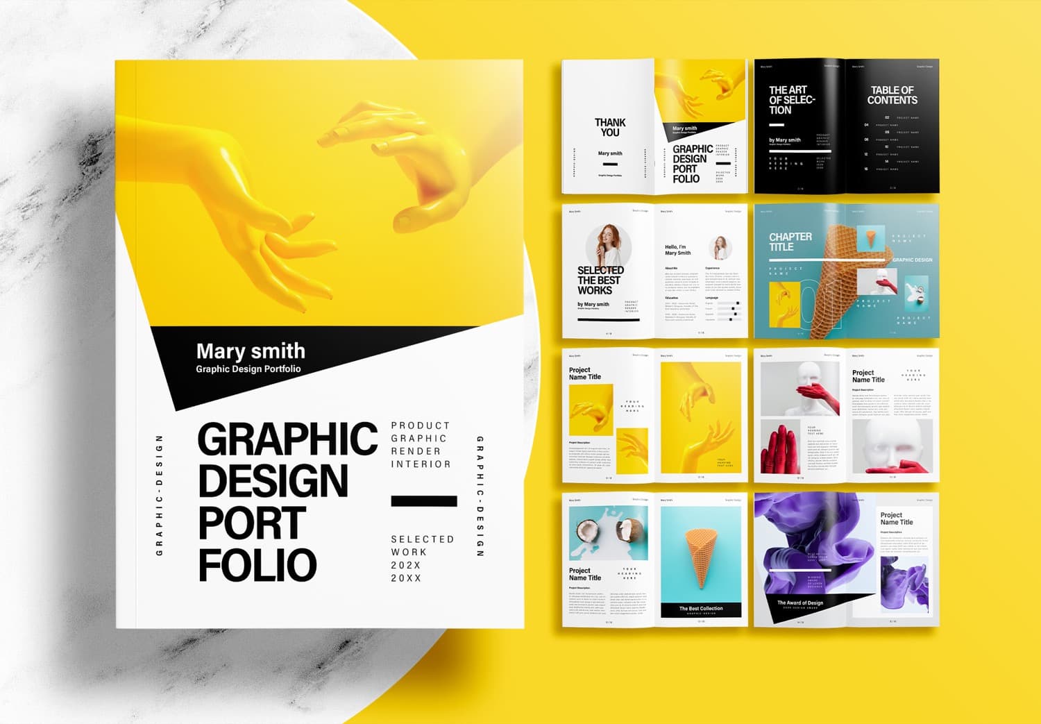
Image Credit
Beyond memorability, unconventional typography subtly communicates professionalism and innovation. When Visual Thinkers meticulously select fonts that harmonize in unexpected ways, it signals an attention to detail and a forward-thinking approach that clients and audiences appreciate. It suggests that your brand, or the brands you represent, are not afraid to carve their own path, inspiring confidence and trust.
The Psychology Behind Unique Font Choices
Every font carries an inherent personality, a subtle language that speaks to our subconscious. A delicate serif might evoke tradition and elegance, while a bold sans-serif screams modernity and strength. When we intentionally pair these personalities in an anti-mainstream fashion, we’re not just designing; we’re crafting a psychological experience. We influence perceptions of trustworthiness, creativity, and authority without uttering a single word.
Strategic font choices can evoke specific emotions, whether it’s a sense of playful wonder, serious gravitas, or approachable warmth. By understanding these inherent characteristics, Visual Thinkers can harness the power of unique font combinations to guide audience response, fostering stronger engagement and connection with the visual narrative.
The ‘Rule of Three’: Crafting Harmonious Anti-Mainstream Font Pairings
While often advised against, the ‘Rule of Three’ in font pairing, when executed thoughtfully, can unlock unparalleled visual depth. The methodology for success hinges on assigning clear roles: one dominant display font for impact, one highly readable body font for sustained engagement, and a complementary accent font for specific, high-visibility elements like call-to-actions or quotes.

The magic lies in striking a balance between contrast and cohesion. The display font should be unique and eye-catching, the body font effortlessly legible, and the accent font a subtle nod that bridges the two or adds an unexpected twist. This deliberate interplay prevents visual clutter, ensuring your design remains professional while feeling distinctly anti-mainstream.
Case Study 1: Bold & Modern Anti-Mainstream Font Pairing
Imagine a brand that exudes innovative energy and contemporary flair. For this, we might combine a strikingly geometric sans-serif (e.g., Montserrat Black) as the display font, commanding attention with its weighty presence. For body text, a clean, highly legible humanist sans-serif (e.g., Open Sans Regular) provides balance and readability, keeping the flow professional.
To inject an anti-mainstream edge, an unexpected, slightly condensed serif with sharp terminals (e.g., Playfair Display SC Light) could serve as the accent. This creates a fascinating tension between modern boldness and a hint of classic sophistication, ideal for tech startups, luxury fashion, or forward-thinking architectural firms.
Case Study 2: Elegant & Sophisticated Anti-Mainstream Font Pairing
Consider a high-end service or a creative agency seeking to convey refined elegance with a contemporary twist. Our display font could be a unique, high-contrast serif with delicate swashes (e.g., Cinzel Decorative Bold), instantly suggesting luxury and artistry. For the body text, a simple, elegant sans-serif (e.g., Lato Light) maintains readability without competing with the display’s ornate nature.

Image Credit
The anti-mainstream touch arrives with an unexpected, slightly distressed script or a minimalist mono-spaced font (e.g., Cutive Mono) as the accent. This adds an intriguing layer of handcrafted authenticity or technical precision, perfect for bespoke jewelry brands, artisanal food products, or fine art galleries.
Case Study 3: Playful & Engaging Anti-Mainstream Font Pairing
For brands that thrive on creativity, approachability, and a touch of whimsy, a playful anti-mainstream font pairing can truly shine. We might choose a bold, rounded display font with personality (e.g., Luckiest Guy) to grab attention. Its friendly curves instantly communicate an inviting tone. To anchor the playfulness, a straightforward, modern sans-serif (e.g., Nunito Regular) provides the necessary readability for longer passages.

The unique accent could be a hand-drawn serif or a quirky display font with unique ligatures (e.g., Gochi Hand), used sparingly for headings or key phrases. This combination is fantastic for children’s brands, creative blogs, indie game studios, or any platform that wants to convey joyous originality without sacrificing clarity.
Tips for Mastering Anti-Mainstream Font Pairing
Mastering the art of anti-mainstream font pairing requires more than just picking pretty fonts; it demands a keen eye for detail and a strategic approach. First, prioritize contrast. This doesn’t just mean different fonts; it means contrast in size, weight, style (serif vs. sans-serif), and even mood. A strong contrast ensures that each font serves its purpose without blending into the others, maintaining visual interest.
Next, establish clear typography hierarchy. Your font choices should intuitively guide the reader’s eye through the content, from the most important headlines to the smallest print. The display font should dominate, the body font should be approachable, and the accent font should highlight specific details, creating a natural flow and preventing information overload.
Crucially, never sacrifice readability, especially for your body text. An anti-mainstream choice should enhance, not hinder, comprehension. Even the most unique display font will fail if the accompanying text is difficult to read. Always test your pairings on different devices and screen sizes to ensure legibility across all platforms.
Finally, embrace iterative testing and refinement. What looks good in theory might not translate perfectly in practice. Experiment with different weights, sizes, and color combinations. Seek feedback from others and be prepared to tweak your choices until you achieve that ‘clean’ professional look that embodies your vision.
Visual Conclusion: Mastering the Art of Anti-Mainstream Font Pairing
For Visual Thinkers like us, the journey to truly stand out often begins with the courage to defy convention. Embracing anti-mainstream font pairing isn’t just about choosing unusual typefaces; it’s about mastering a strategic approach that imbues your designs with distinct personality, enhanced memorability, and undeniable professional polish. We’ve seen how thoughtful combinations of three fonts can transform a layout from mundane to magnificent, creating visual experiences that truly resonate.
Whether you’re aiming for bold modernity, sophisticated elegance, or engaging playfulness, the power lies in your ability to blend creativity with foundational design principles. By focusing on contrast, hierarchy, and unwavering readability, you’re not just designing with fonts; you’re crafting compelling narratives that elevate brands and captivate audiences in a world hungry for genuine originality.
At Cipta Visual, we understand the intricate dance between design, strategy, and storytelling. We empower creatives and businesses to build stronger brands through bespoke graphic design, innovative digital marketing campaigns, and impactful visual identities. Our expertise ensures your brand not only looks exceptional but also communicates effectively across all touchpoints, engaging your audience and driving real results.
Ready to bring your unique vision to life with a strong online presence? We specialize in professional WordPress website creation services, delivering modern, responsive designs that are inherently SEO-optimized. Our solutions are built for reliability, offering extensive customization options to ensure your digital storefront perfectly reflects your brand’s anti-mainstream spirit and strategic goals. Let’s create something extraordinary together.
Unlock the full potential of your brand today. Contact us to discuss your next project, or explore our portfolio and services at Cipta Visual for inspiration and partnership opportunities.
Dive Deeper: YouTube Recommendations for Visual Thinkers
For Visual Thinkers eager to expand their knowledge and gain practical insights into typography, these YouTube recommendations offer invaluable perspectives and tutorials. Watch, learn, and apply these lessons to refine your anti-mainstream font pairing skills.
- 3 Anti-Mainstream Font Pairings That Will Blow Your Mind (and Your Clients!): Discover fresh, unconventional font combinations that are sure to impress and differentiate your work.
- The Ultimate Guide to Unique Font Combinations for Stunning Designs: A comprehensive walkthrough on how to select and pair fonts to achieve truly stunning and original visual outcomes.
Sources & References for Visual Thinkers
Our exploration of anti-mainstream font pairing draws upon the wisdom of leading design authorities. For further reading and deeper dives into typography and design principles, we recommend these notable sources: Adobe Creative Cloud Blog, an excellent resource for design trends and tutorials; Canva Design School, offering accessible insights into practical design applications; Smashing Magazine, a treasure trove of expert articles on web design and development, including extensive typography discussions; AIGA (American Institute of Graphic Arts), the professional association for design, providing industry standards and inspiration; and Google Fonts Knowledge, an invaluable guide to open-source typography.
Written with insights from Cipta Visual — helping Visual Thinkers blend creativity, strategy, and storytelling to build stronger brands.
Discover more from CiptaVisual
Subscribe to get the latest posts sent to your email.


